


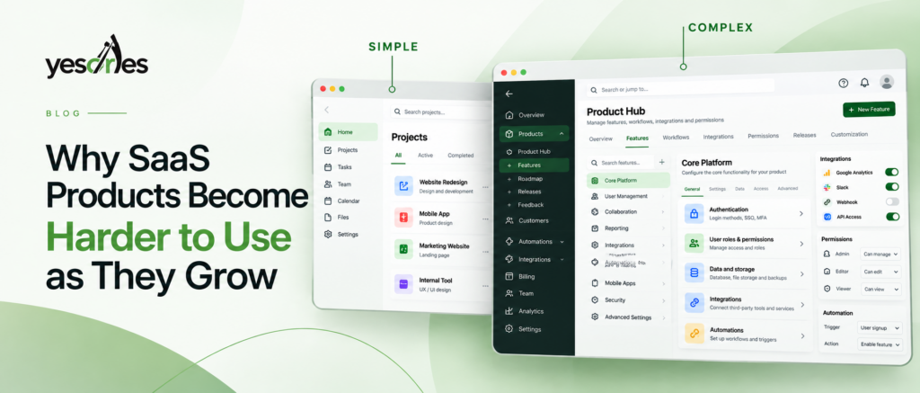
Somewhere between the first hundred customers and the first thousand, many SaaS products start to feel different. The product that once felt sharp and obvious begins to feel heavier. New users take longer to get started, support tickets increase, and internal teams struggle to explain why.
This isn’t necessarily a sign that the design team has become worse. It happens when product capability grows faster than product usability. Every successful SaaS company eventually encounters this gap. The companies that manage it well aren’t those that avoid complexity, but those that learn to diagnose it before trying to fix it.
That diagnosis is the focus of this article.
Why It Happens
Complexity rarely comes from one bad decision. It accumulates through dozens of individually reasonable ones.
Feature accumulation. Each roadmap cycle introduces something new: an export option, permission setting, integration, or customer-requested capability. Each feature may make sense independently, but together they increase what the interface must communicate.
New workflows for new users. Early SaaS products often serve one primary user performing one core task. As customers diversify across roles, company sizes, and use cases, the product must support multiple paths through the same screens.
Integrations and multiple user roles. Admins, managers, and end users may need different views of the same information. Without deliberate role-based design, everyone can end up navigating a product structured for someone else.
Information growth. More data, history, and configuration options gradually turn short lists into large ones. An interface that worked for ten items may become difficult to use with two hundred.
Legacy decisions. Early menu structures, terminology, workflows, and architectural choices become difficult to change because existing customers have developed familiarity with them. The product keeps growing on a foundation designed for an earlier version of itself.
None of these are inherently mistakes. They are normal consequences of growth. The problem is that teams often lack a shared vocabulary for understanding the resulting complexity, so every conversation about “fixing the UX” starts from scratch.
Identify Your UX Complexity: Six Types Worth Naming
Not all complexity is the same. Treating every usability problem as one generic “UX issue” is one reason redesign efforts underperform.
Most SaaS usability problems can be understood through six categories. This isn’t an established academic taxonomy; it is an analytical lens for making an abstract problem concrete enough to diagnose and act on.
1. Feature Complexity
What it means: The product offers more capabilities than users need at once, with too many options remaining visible instead of appearing when relevant.
How it appears: Settings pages with dozens of toggles, toolbars displaying every possible action, or onboarding flows that expose advanced capabilities before users understand the basics.
How users experience it: Users feel overwhelmed before completing the task they came to accomplish.
Warning signs: New users describe the product as overwhelming, feature usage is concentrated around a small portion of the product, or support repeatedly receives questions such as “How do I find X?”
Diagnostic questions: Can a new user quickly identify the three to five actions they need most? Are advanced options competing visually with core actions?
Practical implication: This is usually a layering and prioritization problem, not simply a feature-count problem. The objective isn’t necessarily to remove capabilities, but to make relevant actions easier to find while keeping advanced functionality available when needed.
2. Workflow Complexity
What it means: The steps required to complete a task have grown, branched, or become inconsistent across user types.
How it appears: A task that once took three steps now requires seven because edge cases were added over time. Different roles may complete the same task through different paths.
How users experience it: Users become uncertain about whether they are doing something correctly and frustrated when the same outcome requires different effort depending on where they start.
Warning signs: High abandonment during tasks, users asking colleagues how they normally complete something, or support documentation specifically explaining individual workflows.
Diagnostic questions: Was the workflow redesigned when new user types were introduced, or simply extended? Did multiple ways of completing the same task emerge organically?
Practical implication: Trace workflow complexity back to its origin. Often, a new use case was added without reconsidering the entire flow.
3. Navigation Complexity
What it means: The product’s navigation no longer matches how users think about their work.
How it appears: Deeply nested menus, features scattered across unrelated sections, or labels that made sense when the product launched but no longer reflect its current structure.
How users experience it: They get lost or repeatedly search for pages they have previously used.
Warning signs: Heavy use of search or command palettes as workarounds, users bookmarking URLs because they cannot find pages through navigation, and recurring “Where is X?” questions.
Diagnostic questions: Does the navigation represent the product as it exists today, or as it existed several releases ago? Would a new employee organize the menu the same way?
Practical implication: Navigation complexity is fundamentally an information architecture problem. Every feature added without an IA review can make the structure harder to understand.
4. Information Complexity
What it means: The volume or density of information exceeds what users can comfortably process to make a decision.
How it appears: Dashboards containing every possible metric, tables with excessive columns, or detail pages where critical and irrelevant information receive equal visual emphasis.
How users experience it: They struggle to identify what matters and may overlook information that should have been prioritized.
Warning signs: Users ask what they should actually be looking at, important metrics are missed, or customer success teams repeatedly explain dashboards manually.
Practical implication: This is a prioritization and hierarchy problem, not necessarily a data problem. The goal isn’t always to show less data; it is to show the right information first and give it appropriate visual weight.
5. Interaction Complexity
What it means: The mechanics of using the interface require more effort or precision than the task justifies.
How it appears: Multi-step confirmations for routine actions, inconsistent interaction patterns, or unclear feedback after users perform an action.
How users experience it: Individual interactions may not feel like bugs, but repeated small frictions accumulate into fatigue.
Warning signs: Repeated user errors, support questions about actions that “didn’t seem to work,” or confusion caused by weak system feedback.
Practical implication: Interaction complexity often remains invisible in analytics because each issue looks minor. Direct observation of users performing real tasks is often the fastest way to uncover it.
6. Product Structure Complexity
What it means: The underlying model of how the product’s core objects relate to one another has become inconsistent or unclear. This is complexity at the conceptual level, not simply the interface level.
How it appears: Multiple objects representing overlapping concepts, permission models that don’t match how teams actually work, or pricing structures that don’t align with users’ mental models.
How users experience it: Confusion continues even after users learn the interface because the underlying logic itself doesn’t make sense to them.
Warning signs: New employees take a long time to understand the product’s data model, or customers consistently demonstrate a different understanding of how the product works.
Practical implication: This is often the deepest and most expensive form of complexity to fix because it is structural rather than visual. It may require product strategy work, not just UI changes.
A Diagnostic Framework for Founders and Product Teams
Once these six types have been identified, diagnosis becomes more structured.
For each type, ask three questions:
- Where does this show up? Identify the specific screens, workflows, or features where the warning signs appear.
- When did it start? Look for the origin point: a feature launch, new customer segment, pricing change, integration, or workflow addition.
- What decision does it distort? Identify what users are struggling to decide: what to click, where to go, what matters, or how to complete a task.
Run this exercise across all six categories before deciding what to redesign.
Most products don’t have all six types equally. Complexity is often concentrated in two or three areas. Identifying those areas allows teams to prioritize instead of launching a broad redesign that may address symptoms rather than causes.
How to Diagnose It in Practice
Turning the framework into action doesn’t require an enterprise research budget. It requires structured observation.
- Review actual user journeys, not assumed ones. Session recordings and analytics funnels can reveal paths that differ from the workflows the team designed.
- Identify friction points by examining drop-offs at individual workflow steps rather than only looking at overall conversion.
- Audit navigation against the current product scope. List major features and test whether a new user could realistically find each one.
- Review support ticket themes. Repeated “how do I” and “where is” questions can expose Feature and Navigation Complexity.
- Check feature adoption data. Low usage may indicate that a feature is buried or unclear rather than unnecessary.
- Talk to customer-facing teams. Sales, onboarding, and support often see where users struggle before the problem becomes visible in product metrics.
- Run lightweight usability testing. Even a small number of sessions with representative users can reveal Interaction and Workflow Complexity that analytics alone cannot explain.
The objective isn’t exhaustive research. It is triangulation: combining behavioral data, internal knowledge, and direct observation to identify the real source of friction.
What Not to Do
Several common responses can make product complexity worse.
Don’t remove features immediately. Low adoption doesn’t automatically mean a feature is unwanted. It may simply be poorly surfaced, and removing it could disrupt customers who depend on it.
Don’t simplify without understanding user needs. Reducing visible interface elements may make a screen look cleaner without solving Workflow or Product Structure Complexity.
Don’t redesign screens without understanding workflows. Screen-level improvements rarely solve problems that originate deeper in the product experience.
Don’t treat symptoms instead of causes. Tooltips and guidance can explain confusion, but they don’t necessarily remove the reason users are confused.
Don’t add navigation to compensate for poor information architecture. More menu items and search features can mask Navigation Complexity without actually resolving it.
When to Seek Intervention
Many complexity problems can be diagnosed and addressed internally. Outside intervention becomes more valuable when:
- Complexity spans multiple types, such as Navigation and Product Structure.
- Internal teams disagree about the root cause despite repeated design changes.
- The product has grown to a point where no single person understands how all its parts fit together.
- Complexity is affecting important business metrics such as activation, retention, or sales cycle length.
At this stage, the answer usually isn’t a complete redesign. A scoped UX audit or UX research engagement can help identify where complexity is concentrated and why.
For Product Structure Complexity, the work may also need to involve product strategy because the solution is not purely visual.
Conclusion
Products don’t become difficult to use because teams stop caring about design. They become difficult because growth introduces real complexity faster than teams develop the systems and habits needed to manage it.
The important shift is not trying to make the product “simple” again. It is identifying which kind of complexity you’re dealing with: feature, workflow, navigation, information, interaction, or structural.
Each requires a different response.
If you’re seeing signs of UX complexity, start small. Pick one important part of the product and evaluate it against the six types. Identify where the complexity appears, when it began, and what user decision it makes harder.
That exercise can reveal where to focus far more effectively than starting another general conversation about “improving the UX.”